


If you’ve hung around the A/B testing world long enough, you’ve heard this phrase. And for good reason: it’s true.
But your goal is to make money and to do this, you need winners. Winning tests, that is.
I won’t tell you that all of the tests I’ve shared below are guaranteed to make you money. If that was the case, there’d be no point in testing.
I won’t even tell you that, to have a great testing program, all you have to do is run these tests.
The reality is that a great testing program has the right people and processes in place and sustains long-term value through the careful measurement and review of analytics and test results.
But here’s what I can tell you: The test concepts I’m about to list are ones I’ve seen work for many of my clients. I’ll even go so far as to say that at least one of these test concepts could be a significant winner on your site.
I run these tests because they get results. You can too. (Special note: I saved my favorite one for last!)
Product Pages – A Testing Sweetspot
Product pages are one of my favorite places to test. Traffic is both comparatively high and highly-qualified, as users have taken the time to arrive at a specific product on your site.
Not only that, these users are one step removed from adding your product to their cart, aka the beginning of your checkout funnel.
Here are some of my favorite product page tests.
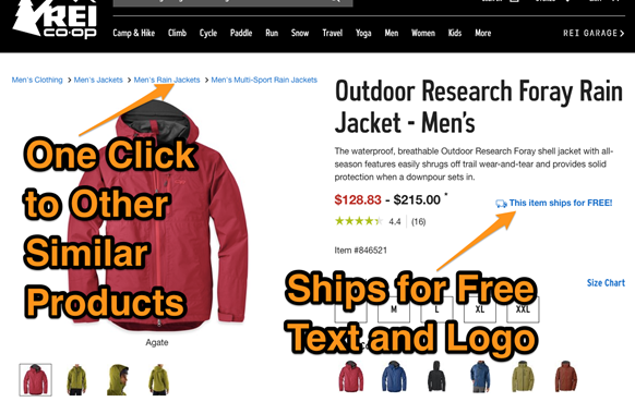
1. Increased Prominence for Product Category Breadcrumb
The category breadcrumb (e.g. Men’s Clothing > Men’s Jackets > Down Jackets) is a central navigational element.
Users who have found themselves on product pages that don’t interest them in have an easy tool to to navigate to other products they may like in category breadcrumbs.
Make sure they don’t miss it
Possible Outcomes: Increased product page views, add-to-carts, conversions.
2. Free Shipping Prominence
Users love free shipping. In fact, some research I and others have done suggests users are more likely to choose free shipping over a greater value percent discount offer.
But if you’re going to offer free shipping, you’ve got to make sure your users see it. Show it on the product page and in other locations on your site. Test adding a logo or a surprising color to make this stand out.
Possible Outcomes: Increased add-to-carts, average order value, and purchase conversion.
Take a look at how REI does it:
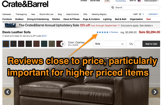
3. Increase Reviews Prominence
Users expect to be able to see how previous purchasers have enjoyed the products they’ve purchased, and this can be achieved with reviews.
But too often, ecommerce sites have no indication above the fold of how to find reviews, other than some star icons. Test adding an anchor link or otherwise increasing the prominence of reviews.
Possible Outcomes: Increased time on site, product page views, product reviews, add-to-carts, conversions.
Crate&Barrel, for example, displays the reviews very close to the price making it hard to miss. I’d love to see them test making this text even larger.
 Homepage – A Page of Paradox
The homepage is a testing paradox. While it gets a lot of traffic, it’s so far removed from your purchase conversion area that changes here don’t always have a direct impact on key metrics like conversions.
For this reason, some of the best homepage tests are those that focus on goals that are valuable and that’ll eventually contribute to purchase conversions, but that may not impact purchases right away.
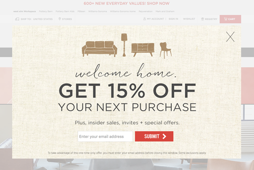
1. Lightbox Email Capture
A good percentage of users who arrive directly on your homepage will likely already be familiar with your brand and, as a result, may already be willing to sign up for emails. A lightbox that displays on page load can sometimes drive dramatic increases to email signup rates, thanks to these visitors.
This is important to test, however, as some users may bounce if immediately presented with a lightbox, like the one shown below from WestElm. Set up audience segments to track direct entry users and see if their reactions differ from other segments (e.g. organic search users).
Possible Outcomes: Increased email signup and eventually higher traffic from emails and higher conversion rates.
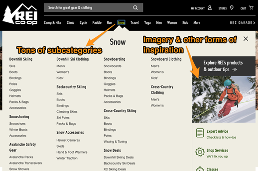
 2. Mega Navigation
A mega navigation is a navigation bar with a huge number of categories, subcategories and even possibly images and promos.
Technically, navigation bars are global elements – as they occur on all pages – but they do double duty on the homepage.
First, mega navigation bars can help users quickly navigate to the specific categories they already had in mind. Second, they expose users to other categories they may not have even been aware of and, in doing so, plant the seed for additional purchases.
Test a larger and much more detailed navigation bar, like the one featured by REI.
Possible Outcomes: Increased navigation clicks, higher average order value, reduced bounce rate.
 3. Category Imagery
Much like mega navigation bars, category images can inspire users to discover products they didn’t even know they were interested in.
Not only that, but consider that, for all the money you’ve spent on beautiful product imagery, why wouldn’t you use your homepage to show it off?
Test adding large blocks of product category images to your homepage. Depending on your brand’s image, you may want to test a more inspirational tone like Crate & Barrel, or a more navigational layout like Target.
Possible Outcomes: Reduced bounce rate, increased category and product page views, increased average order value.
Crate & Barrel
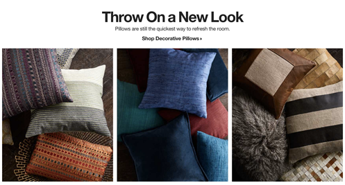 “Ah! Wouldn’t some new pillows on the couch be nice this fall?”
Target
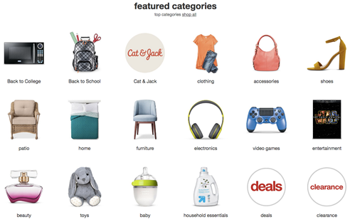 “Now where is the clothing section…oh yeah, I also need some laundry detergent and a gift for that baby shower next week.”
Search Pages – Make It Easy for Users to Find Their Product
Depending on your site design or the number of products you carry, searching may be one of the most common actions users do on your site.
The tests below have often given me good results – frankly, surprisingly good. To top it off, some of these tests are easy to implement on search results pages, so there’s little risk in trying them out.
Remember, the easier a test is to set up, the greater your return on the “effort vs. value” scale.
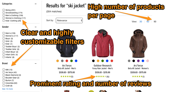
1. Products Per Page
In today’s world of mobile devices, users have become accustomed to lots of swiping and scrolling. This trend has extended to the desktop as well.
If a user performs a search that results in 80 matches, why make the user click through four different pages by showing only 20 per page?
Defaulting to the highest number of results per page means users have a better chance of seeing your entire list of relevant offerings.
Possible Outcomes: Increased product page views, increased conversion.
2. Prominent and Highly Customizable Filters
Too many sites either have too few filter options, or filter options that aren’t customizable (i.e. you can’t mix and match).
So while your site may have a great selection of 627 earings, can users find the silver ones for under $200 that also have turquoise stones?
If your site doesn’t have this functionality implementing it can take a bit of effort. But a test that increases filter prominence (versus additional features) through easy-to-implement style changes is a great way to find out if the extra investment in a functionality test is worth it.
Possible Outcomes: Increase site searches, increased purchase conversions.
3. Reviews on Search Results
Users love reviews, and they’re more likely to click on search results if they can see the customer review rating as well as the number of total reviews given right on the search results page (e.g. 4.5 out of 5 stars from 24 reviews).
Test adding the review stars if you don’t have them, or test making them larger and more prominent if you already do.
Possible Outcomes: Increased product pageviews, higher purchase conversion rate.
You can see all three of these elements at work on REI.com:
 Checkout Funnel – Real Return Close at Hand
Funnel testing is one of the most exciting places to test. Users are oh-so-close to actually making a purchase, so any increase in the numbers here means a real increase in revenue.
As funnels have become more and more standardized, achieving eye-popping results can be hard. Fortunately, there is still a set of commonly testable changes that really drive results. These are my favorite funnel tests:
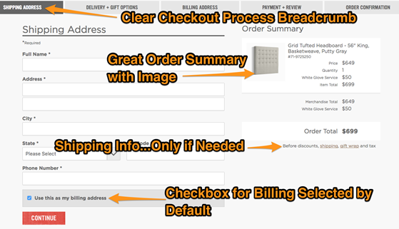
1. Billing Same as Shipping
If you have two sets of fields exposed for billing address and shipping address, you’re creating friction. Users may be overwhelmed by the fields and stop the checkout process entirely.
Instead, test selecting the “same as billing address” checkbox by default and hiding those fields until a user deselects that checkbox. Every time I’ve tested this, it’s won.
So why test? Just imagine two possible conversations with your manager:
- #1: “I implemented a checkbox that defaults to combine the shipping and billing fields and I think it makes the checkout process better.”
- #2: “I implemented a checkbox that defaults to combine the shipping and billing fields and it resulted in 12% conversion improvement for an annualized incremental return of $458,000 dollars.”
I think you get the picture…
Possible Outcomes: Increased purchase conversion rate.
2. Shipping Estimate Removed
If your site has shipping estimate fields on the cart page, test removing them.
Some sites that only sell items with typically high shipping charges may not see this work – which is why it’s worth testing. But for the sites I’ve tested this on I’ve seen stellar results.
Possible Outcomes: Increased conversion rate.
3. Checkout Breadcrumb
Users like to know where they’re going; sometimes, knowing where you’re going is just as important as getting there quickly.
In fact, some of the best performing checkout funnels I’ve seen have actually had the most steps – but they’ve been super clear about what each step is and what comes next.
To find what works best for your site and your audience, test increasing the prominence and clarity of your checkout breadcrumb.
Possible Outcomes: Overall reduced funnel drop-off and increased purchase conversion.
WestElm.com does several of these things well. Here’s how their checkout looks:
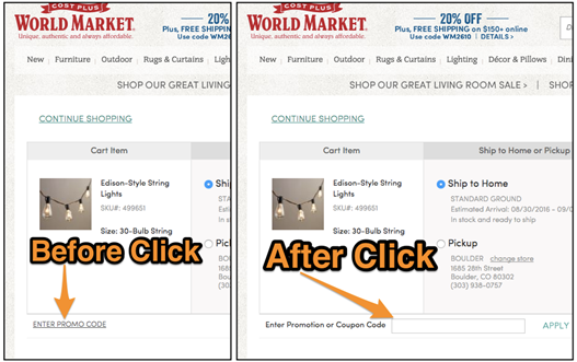
 4. Promo Code Field
This is literally my favorite test of all time. Actually, it’s two tests and they’re both pretty darn easy.
- #1: If your site has a promo code field on the cart page or any other place in the funnel that’s not the pricing page, remove it. You only need this field in one place.
- #2: Change the promo code field to a link reading “Have a promo code?” When this link is clicked, expose the field.
These tests work because every user wants a discount and an obvious promo code field creates a distraction. Further, users who already have a promo code are motivated to find the field, so clicking a link to expose it isn’t difficult.
In short, making the field a little less obvious reduces friction for those who don’t have a promo code and isn’t a problem for those who do.
Possible Outcomes: Increased average order value, increased conversion rate.
Here’s how it looks on WorldMarket.com:
 We all know that testing is hard – and it’s certainly harder than some blog posts make it seem. That said, having run a ton of tests with hundreds of clients, I often go back to these simple experiments, thanks to their relative ease of implementation and their consistent results.
Have you tried any of these and had success? What are your “bread and butter” tests for e-commerce? Let me know if you’ve seen any great or surprising results from these tests or others like them. Id love to hear your thoughts below:
Header Image: Flickr