


Ecommerce retailers live and die by their ability to convert website visitors into buyers.
Unfortunately, success selling online isn’t as simple as more visitors = more sales.
As you likely already know, getting traffic to your online store isn’t always the problem. Where many online retailers struggle is getting that traffic to convert and actually buy some product.
With average cart abandonment rates sitting at approximately 68%, you need to button down your product pages – and your sales funnel in general – to get more of those customers to complete the checkout process.
This is especially important as it’s becoming increasingly more difficult to achieve revenue growth as competitors pop up more and more often – competition that stems from the fact that more consumers are shopping online than ever before.
One comScore survey revealed that consumers are doing more than 50% of their shopping with brands online. That’s up from 47% in 2014.
Not sure that your product pages are pulling their weight? Below, I’ll walk you through the 10 things consumers need to see on every product page if you’re serious about lifting your conversions and growing your revenue:
1. Super Compelling Product Copy
A product description isn’t just a general description of the product. Your customer can establish that much on their own by looking at the product photo.
The description needs to go much deeper, creating a compelling case for why your customer needs it.
A strong, compelling product description achieves several things:
- It established the value proposition; what the customer is going to get out of buying your product.
- It provides a list of benefits from owning and using the product, often derived from the product features themselves.
- It uses a tone that reflects the brand, but that also appeals specifically to the target audience.
- It’s scannable, so a prospective customer can read it quickly and get the idea without reading a wall of text.
- It uses persuasive words that are descriptive, action oriented and specific to the solution being provided.
- It’s optimized for the words and phrases customers use to find similar products and to support prospects in different stages of the buying funnel.
- It’s creatively unique; don’t just replicate the descriptions you got from the manufacturer.
There’s no right or wrong length when it comes to product copy. The most compelling product descriptions use enough words to make the sale.
“Clarity trumps persuasion,” writes Peep Laja of ConversionXL. “The best sales copy is full, complete information. No hype needed.”
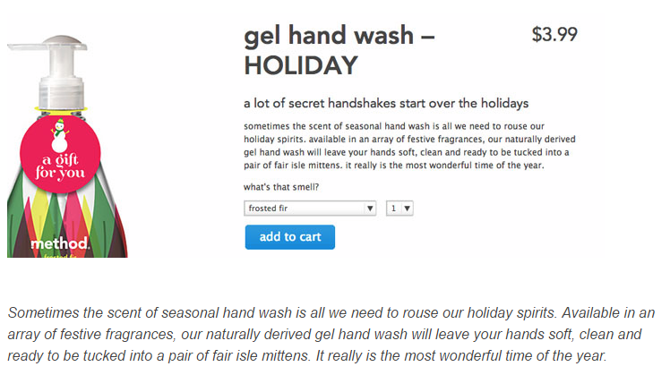
Method Home does an excellent job of creating simple, persuasive copy for their gal hand wash.
Rather than just listing bullet points, the simple description outlines the benefits of the soap in a creative and compelling way.
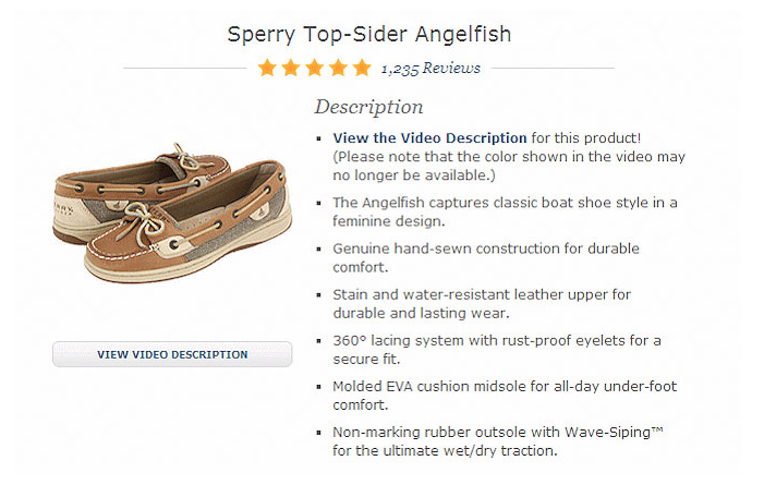
The above example from Sperry Top-Siders shows how boring product features can be transformed to communicate the benefits with your customers.
It doesn’t just state that it’s a molded EVA cushion; after all, most customers won’t know what that it is. Instead, this product page elaborates on the feature by stating the cushion provides all-day comfort.
Make sure your customers know what they’re missing if they don’t buy the product. Highlight those benefits with clear, concise copy.
2. Eye-Grabbing Images
There’s no point in trying to sell products online if you’re not going to feature quality images that help sell the product and build visibility.
The images you place need to be visually appealing, and they need to be optimized to lift conversions, as well as your organic search visibility.
Big, detailed product photos have proven in A/B tests to improve conversions as well.
In one study from VWO, one retailer was able to lift conversions by 9.46% just by increasing the size of quality product images.
When optimizing the images on your product pages:
- Don’t stick with just generic product photos; show the product in use
- If your products look great, make sure your images do them justice
- Let the images show off the product features you’re highlighting in the benefits
- Provide 360 degree views, or take pictures from every angle
- Embed user generated content from your fans, when possible
- Use optimized, compressed images to reduce load speed and to avoid site speed penalties from Google
- Use high quality images so users can zoom in and see fine details
- Optimize image alt and title tags for improved search visibility and in-site search
Jeni’s does a terrific job at showing off their ice cream product in the online store.
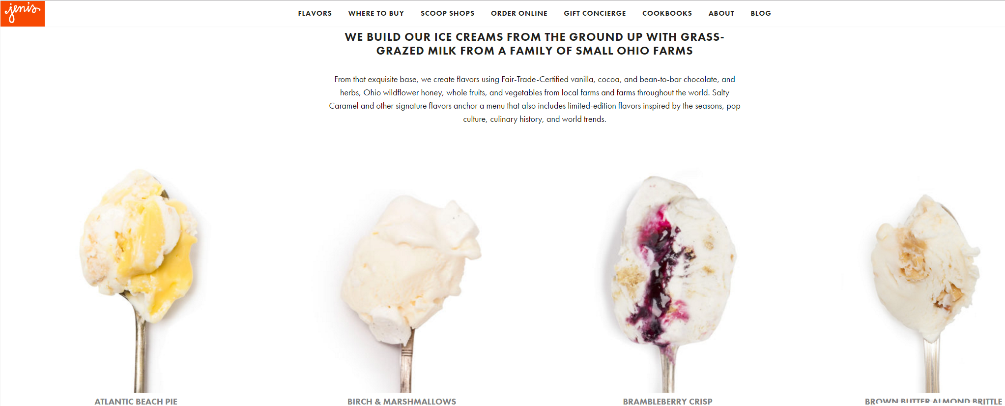
Rather than just showing buckets of ice cream with labels, they show off the actual product, creating a mouthwatering connection with ice cream lovers and fans.
3. Captivating Videos
Videos can add some serious conversion lift to your product pages. Since customers can’t pick up and handle your products, your images and videos can paint a clear picture about the product.
Video is particularly helpful because you can showcase how the product is used, how it benefits the customer, and how it solves one or more problems.
This is also a prime opportunity to showcase user generated content.
Featuring your customers using and enjoying your products not only helps present the product, but also adds a level of social proof that can lift conversions in your store.
Customers who viewed video are 1.8x more likely to make a purchase, according to a study cited above, so ask your audience to start sharing videos with you (offer an incentive to entice them, if needed).
Insert the videos into your product pages, share them across your social channels with links back to your product pages, and start using them in product advertisements.
Home Depot, for example, uses product videos for a large number of products to help showcase features and benefits.
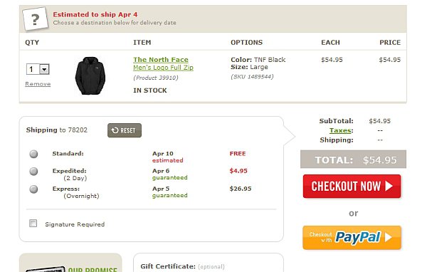
4. Unconditional Free Shipping
Shipping is a top killer of conversions. The majority of your shopping cart abandonments occur when customers add desired products to the cart and then are greeted by $3, $5 or more in shipping costs in the checkout process that they didn’t anticipate.
Understandably, this prompts them to comparison shop to try and find the product somewhere else that’s offering free shipping.
Some brands try to entice customers into converting, while also increasing the value of the order, by using conditional free shipping.
In fact, one study found that 52% of shoppers have added items to their cart to qualify for free shipping.
This can reduce cart abandonment to some degree, but the best way to eliminate this friction is to provide free shipping regardless of how much the customer purchases.
While only about 50% added product to qualify for free shipping, 93% of consumers feel compelled to buy more and make a purchase when shipping is completely free.
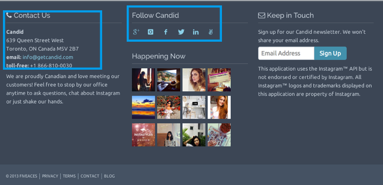
5. Signals that Build Trust
If you want more people to buy from you, you have to earn their trust.
Think about it… You’re asking customers to provide you their personal information – as well as access to their financial data – with every transaction.
They want to know, even subconsciously, that their data is safe and they won’t get scammed.
This is an easy fix that you can do in minutes on your website by adding a few trust signals in the places where info is carried from page to page (for instance, the header and footer):
- Insert your phone number; include a toll free and local number to show legitimacy
- Emphasize legitimacy by putting your company address (not a P.O. box) in the footer
- List certifications including Verisign or ISO certs, as well as any industry accreditations you hold
- Share links/icons for your active social media accounts
- Offer a live chat interface
6. Multiple Payment Options
When shopping online, it frustrates me to no end to hit a checkout online where there’s no other payment option besides credit card.
Considering how simple it is to integrate other payment methods, every cart should at least have a PayPal integration.
I’ve abandoned carts before when PayPal wasn’t an option, simply because I didn’t have my wallet handy and I needed to order a product on the fly.
I’m not alone in the sentiment either. A 2009 survey of some 2,000 consumers found that more than half of respondents stated that if their preferred payment method wasn’t available, they’ll cancel a purchase.
Even more interestingly, a PYMNTS.com study conducted in collaboration with BlueSnap found that the “sweet spot” for number of payment options is 6.8, while the “underperformers” in their research averaged just 4 payment methods on offer.
If you want more conversions in your store, be mindful of shoppers who expect more payment options.
You can leverage this desire on your product pages by providing the logo or messaging that shows – before they even hit the checkout – what payment methods you accept.
If a customer is considering a product, and they see right next to the “add this to my cart” button that you accept PayPal, Apple Pay and even Amazon Payments then they’ll be more likely to just add the product because of the convenience you offer.
7. Precise Call to Action
Speaking of calls to action, yours could probably use a little improvement.
Your audience should never have to hunt for the button to add a product to the cart, or to proceed to checkout.
If they do, you’ve got a user experience problem that is going to hurt your conversions.
Here are some tips for creating product page CTAs that will lift conversions:
- Make it larger than the elements that surround it so it’s more visible
- Use a contrasting color; something different from your site’s theme (orange and red are most common)
- Use actionable words and verbs that provoke the user to click
- Personalize the call to action. Instead of just “add to cart” try “add to my cart”
- Never use text links for adding products or proceeding forward
Most importantly, don’t assume that following all these tips guarantee success.
Always test changes you make with CTAs like to ensure that you’re improving conversions.
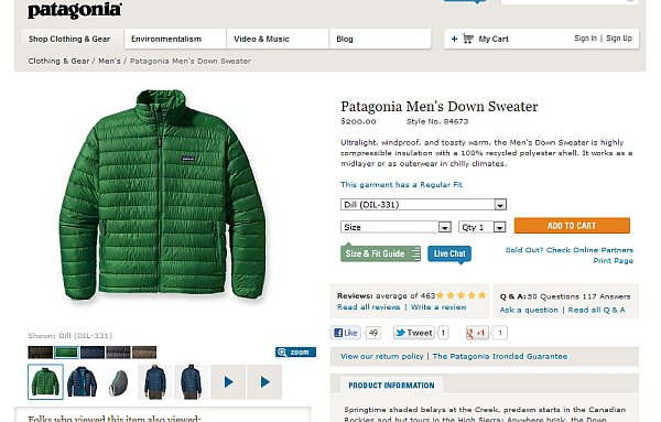
Here’s a great example of a prominent call to action button from Patagonia:
8. Simplified Checkout
If you want to maximize conversions, you need to make the checkout process as simple as possible.
That starts on your product page.
A customer should be able to go from your product to the checkout, in as few clicks as possible.
If they have to click a button, then register, then wade through upsells and offers – and then go through a 3-part checkout process – you’re likely going to lose the sale.
Simplify your checklist.
Take would-be buyers directly from the product to the checkout process when they add a product. If they want to buy more, you can display a “continue shopping” button.
In many cases, your customers are ready to finish, and you’ve taken them from a 5+ step checkout process down to just 2 steps.
9. Social Proof
Social proof has a tremendous influence on your conversion process and whether or not your customers are purchasing from you.
Consider for a moment… If you were trying to purchase a product and found a two different types of that product offering a similar solution, with the same price, which would you buy?
Now let’s say that on one site, product A has no reviews posted.
On the other site, product B has over seventy reviews averaging about 4.8 stars. Most are positive with just a couple average reviews. The positive reviews praise not only the quality of the product but the customer service and delivery time of the company.
You’re more than likely going to order the product with the wide range and volume of reviews.
That’s how most customers shop. In fact, more than 92% of consumers trust peer reviews over brand advertising.
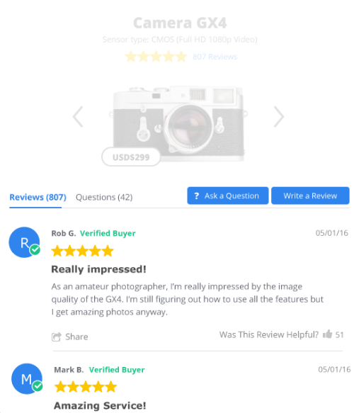
Even negative reviews shouldn’t be considered a deal-breaker. Multiple studies – including this report from Econsultancy – have proven that a mix of both positive and negative actually helps instill trust in a brand’s consumers.
You can give your conversions a solid boost by giving your customers a voice and presenting the reviews you’ve gathered boldly on your product pages.
Most ecommerce platforms come with review systems built in, but it’s best to invest in something like Yotpo that makes your reviews more visually engaging.
10. Upsells & Related Items
Traditionally, online retailers like to tag customers in the cart and offer up related products and upsells during the checkout process.
They feel like they’ve got you in a position where you’re already spending money, so what’s a little more to boost the average order value?
It’s the same strategy brick and mortar stores have been using for decades; placing low-cost goods around the checkout, where you’re more likely to grab something quick without thinking too much about it.
The problem with this approach is you’re adding steps/clicks to the checkout process. It’s also an interruption to the customer who was ready to buy.
They may decide to research that upsell item, exiting the checkout to go back into your product selection. This gives them too much opportunity to exit your site or start comparison shopping, which could result in an abandoned cart.
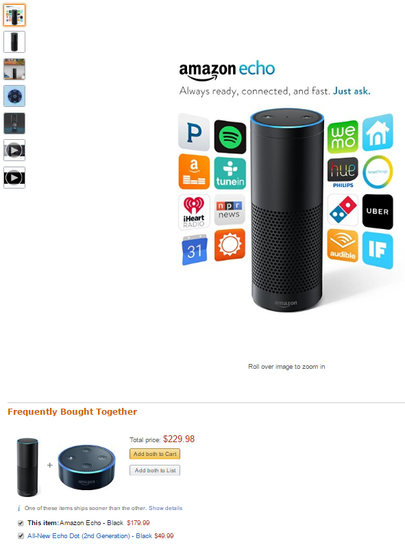
Instead, list upsell items and related products directly on your product page.
Many e-commerce platforms offer application integrations where you can use 3rd party apps to present products in this manner – a common tactic used on Amazon.
If the customer is interested, they can add the extra product from the product page without interrupting the checkout process – and you still increase your average order value.
Ultimately, there are lots of ways you can increase your ecommerce store’s sales, but there’s no guarantee that every tactic is going to lift your conversions. A lot of that comes down to what you sell, how your present, your audience, seasonality, market competition and more.
Take my advice above, but do so only with a strategy for testing every change.
This way you can shut down what isn’t working and continue to improve on the changes that are actually improving your conversions rates.
What do your product pages look like? Do you use any of these methods to lift conversions in your online store? Share your thoughts and tips with me in the comments below: